
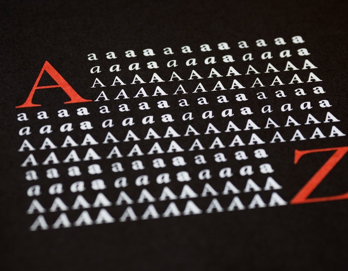
Most web pages fail for a boring reason: everything on them looks equally important. The visitor lands, scans for two seconds, finds no obvious starting point, and leaves. Typographic hierarchy is the fix, and it costs nothing but a few deliberate decisions about size, weight, spacing and contrast.
This guide breaks down what typographic hierarchy actually is, the four levers that create it, and a three-level system you can apply to your next page without a design degree.
What Is Typographic Hierarchy?
Typographic hierarchy is the ordering of text by visual weight so a reader can tell at a glance what is a title, what is a subheading, what is body copy, and what is a caption. It is the visual grammar of a page: it tells the eye where to land first, where to go next, and what can safely be skipped.
A useful way to think about it: hierarchy is not decoration, it is navigation. Before anyone reads a single word of your content, they have already decided, unconsciously, how to move through it. Typography made that decision for them.
Hierarchy works because human vision is lazy in a very predictable way. The eye is drawn to whatever is biggest, boldest, darkest, or most isolated on the page. Every typographic choice either reinforces that instinct or fights it.
Hierarchy vs. Visual Hierarchy: What Is the Difference?
Visual hierarchy covers everything on the page: images, colour blocks, buttons, whitespace, icons. Typographic hierarchy is the text-only subset of it. On content-heavy pages (blogs, documentation, landing pages, SaaS dashboards) typographic hierarchy does roughly 80% of the work, because text is most of what is there.

The Four Levers That Create Typographic Hierarchy
You only have four real tools. Beginners usually overuse the first one and ignore the other three.
| Lever | What it does | Beginner rule |
|---|---|---|
| Size | The loudest signal. Bigger text reads as more important. | Each level should be at least 1.25x the next one down, or the difference looks like a mistake. |
| Weight | Adds emphasis without taking more space. Ideal for small screens. | Use two or three weights maximum (e.g. 400, 600, 700). Skip the ones in between. |
| Spacing | Groups related items and separates unrelated ones. The most underrated lever. | Space above a heading should be larger than the space below it. |
| Contrast | Colour, case, style and typeface differences that push text forward or back. | Demote secondary text with a lighter grey rather than making it smaller. |
1. Size: Build a Scale, Not a Guess
Random font sizes (17px, 23px, 31px) create visual noise. A modular type scale picks one base size and multiplies it by a fixed ratio, so every step feels intentional. A ratio of 1.25 (major third) is safe and readable for web body content.
A practical scale built on a 16px base:
| Element | Desktop size | Mobile size | Weight | Line height |
|---|---|---|---|---|
| H1 / page title | 48px | 32px | 700 | 1.1 |
| H2 / section heading | 32px | 26px | 700 | 1.2 |
| H3 / sub-section | 24px | 20px | 600 | 1.3 |
| Body copy | 18px | 16px | 400 | 1.6 |
| Caption / meta | 14px | 13px | 400 (grey) | 1.4 |
Notice two things: line height decreases as size increases (big text needs tighter leading), and the gap between H3 and body is deliberately small, because weight and colour carry the difference instead.
2. Weight: The Quiet Workhorse
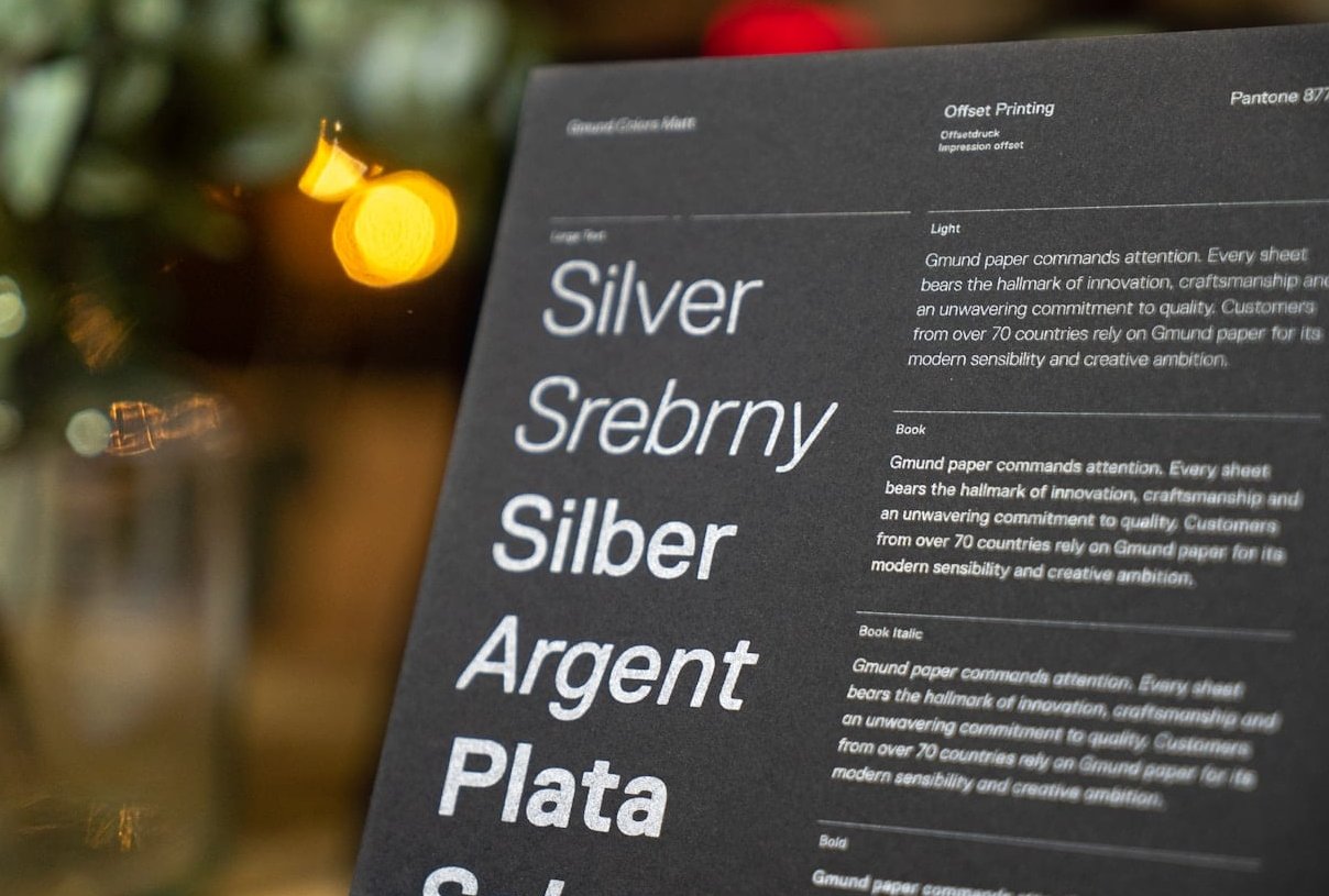
On mobile you run out of room to enlarge things quickly. Weight solves this. A 20px heading at 700 weight sitting above 16px body at 400 weight reads as clearly hierarchical even though the size gap is modest.
- Do not use weights below 300 for body text on light backgrounds. Thin text on white is a readability trap.
- Avoid faux bold. If your font family has no real 700 weight, the browser synthesises one and it looks smeared.
- Bold inside a paragraph is a fourth-level signal, not a heading. Use it for one phrase, not three sentences.
3. Spacing: Where Beginners Lose the Most
Proximity is a hierarchy signal in itself. If a heading sits equally far from the paragraph above and the paragraph below, the reader cannot tell which block it belongs to.
The 2:1 spacing rule: give a heading twice as much space above it as below it. Example: 64px top margin, 24px bottom margin. The heading then visually “sticks” to the text it introduces.
Other spacing rules worth memorising:
- Measure (line length): keep body copy between 50 and 75 characters per line. Longer lines make the eye lose its place on the return sweep.
- Letter spacing (tracking): tighten large headings slightly (-0.02em) and loosen small uppercase labels (+0.08em). Never track out lowercase body text.
- Paragraph rhythm: pick either a blank line between paragraphs or a first-line indent. Never both.
4. Contrast: Colour, Case and Typeface
Contrast lets you create hierarchy without touching size at all:
- Colour weight. Body text at #1A1A1A, secondary text at #6B7280. The grey text recedes instantly.
- Case. ALL CAPS at small sizes makes an excellent eyebrow label above a headline. Never use caps for a full paragraph, since word shapes disappear and reading speed drops.
- Typeface pairing. One serif for headings, one sans-serif for body is the classic two-font pairing. Two sans-serifs that look similar is the classic mistake.
- Style. Italics work for quotes and captions, not for emphasis inside dense paragraphs.
Always check contrast ratios: 4.5:1 minimum for body text and 3:1 for large text, per WCAG. Pale grey captions are the most common accessibility failure on otherwise well-designed sites.

The Simple Three-Level Hierarchy System
Forget six heading levels. Most pages need exactly three. Here is the system to apply immediately.
Level 1: The Primary Signal (one per page)
This is the page title or hero headline. It answers “what is this page?” in under two seconds. Rules:
- Only one Level 1 element per page. Two competing headlines cancel each other out.
- Largest size, heaviest weight, tightest line height.
- Keep it to a single line on desktop and two on mobile if possible.
Level 2: The Scanning Layer
Section headings (H2 and H3) exist for people who are not reading. Roughly 80% of visitors scan before committing. Your Level 2 headings should work as a standalone summary of the page if read on their own.
- Clearly smaller than Level 1, clearly bigger and bolder than body.
- Front-load the meaningful word: “Pricing for small teams” beats “What about pricing for small teams?”
- Give them generous space above so they act as visual chapter breaks.
Level 3: Body and Support Text
Everything else: paragraphs, lists, captions, labels, legal text. The goal here is comfort, not attention.
- 16px minimum on mobile, 18px preferred on desktop.
- Line height 1.5 to 1.7.
- Demote captions and metadata with colour, not with a tiny size.
The test: squint at your page, or blur it in your image editor. If you can still identify three distinct tiers of text, your hierarchy works. If it all blurs into one grey mass, your levels are too close together.
Annotated Examples From Real Layout Patterns
Example A: The SaaS Landing Page Hero
Typical stack, top to bottom:
- Eyebrow label (13px, uppercase, +0.08em tracking, brand colour): categorises the offer.
- Headline (56px, 700 weight, line height 1.05): the single biggest element on screen.
- Sub-headline (20px, 400 weight, grey): one sentence of clarification, deliberately 3x smaller than the headline.
- Button label (16px, 600 weight, high contrast background): small text but highest colour contrast, which is why the eye finds it instantly.
What makes it work: the jump from 56px to 20px is enormous. Beginners usually set the sub-headline at 32px, which creates two Level 1 elements and confuses the eye.
Example B: The Blog Article Layout
A news or blog template usually runs: title (40px/700), byline and date (14px grey), lead paragraph (20px, slightly darker), then body (18px). The lead paragraph is a bridging level: bigger than body, smaller than any heading, used to pull the reader from the title into the text.
Pull quotes sit at 24px italic with large vertical margins. They work only because the surrounding body is calm. On a page with five font sizes already, a pull quote adds nothing.
Example C: The Pricing Table
Pricing cards are a hierarchy exercise in miniature:
- Price is Level 1 inside the card (40px, 700). It is what everyone is looking for.
- Plan name is Level 2 but set smaller than the price, often uppercase, because the number matters more than the label.
- Feature list is Level 3 at 15 to 16px, with consistent icon alignment doing the grouping work.
The recommended plan breaks hierarchy on purpose with a border, a badge, or a background shift. Deliberate rule-breaking only reads as intentional when the rest of the system is consistent.

Common Typographic Hierarchy Mistakes
| Mistake | Why it hurts | Fix |
|---|---|---|
| Too many levels (6+ sizes) | No level stands out, so none guide the eye | Collapse to three primary levels plus captions |
| Levels too similar (18px vs 20px) | Reads as an error, not a hierarchy | Use a 1.25x or 1.33x scale ratio |
| Headings styled for looks, not structure | Breaks screen readers and SEO parsing | Keep H1 to H4 order logical, style with CSS |
| Equal spacing everywhere | Sections never visually separate | Apply the 2:1 space above / below rule |
| Centred long paragraphs | Ragged left edge slows the return sweep | Left-align anything over three lines |
| Low contrast grey on grey | Fails accessibility, invisible in sunlight | Test every text colour at 4.5:1 minimum |
Typographic Hierarchy and SEO
Visual hierarchy and semantic hierarchy are two different things, and they need to agree. Search engines read your HTML heading structure, not your font sizes. A <div> styled at 48px bold is a headline to humans and plain text to crawlers.
- One H1 per page, matching the main topic.
- H2 for main sections, H3 for sub-points inside them. Do not skip from H2 to H4.
- Style the appearance with CSS classes if you need a small H2 or a large H3. Never pick a heading tag based on how big it looks.
This also improves your chances of winning featured snippets and “People Also Ask” placements, because clean heading structure makes your answers extractable.
Your 7-Step Hierarchy Checklist
- Pick one base body size (16px mobile, 18px desktop).
- Generate a scale with a fixed ratio of 1.25 or 1.33.
- Limit yourself to two typefaces and three weights.
- Define exactly three text levels plus a caption style.
- Set spacing with the 2:1 rule above and below headings.
- Cap line length at 75 characters.
- Blur-test the page, then run a contrast check.
FAQ
What is hierarchy in design?
Hierarchy in design is the deliberate arrangement of elements to show their relative importance. It tells the viewer what to look at first, second and third. Typographic hierarchy is the text-specific version of this principle, achieved through size, weight, spacing and contrast.
What is the 3 font rule?
The 3 font rule says you should never use more than three typefaces in a single design, and most of the time two is better: one for headings, one for body text. Fewer fonts means the differences you do create carry more meaning. You can still build rich hierarchy from a single family by varying weight, size, case and colour.
How many heading levels should a web page have?
Visually, three levels are enough for most pages. Semantically, use as many heading tags as your content structure genuinely requires, but keep the order logical (H1, then H2, then H3). Deep nesting beyond H4 usually signals that the page should be split into several pages.
What is tracking in typography?
Tracking is the uniform adjustment of space between all characters in a block of text, as opposed to kerning, which adjusts the space between two specific letters. Negative tracking tightens large headlines; positive tracking improves the readability of small uppercase labels.
How does font weight affect readability?
Weight affects the contrast between text and background. Medium weights (400 to 500) are the most comfortable for long body text. Very light weights lose legibility on small screens and low quality displays, while very heavy weights close up the letter counters and slow reading when used in paragraphs.
Can I build hierarchy with one font only?
Yes, and it is often the cleanest approach. A single variable font family with three weights, four sizes and two text colours gives you more than enough distinct levels. Single-family systems are also faster to load and easier to keep consistent across a site.
Final Word
Typographic hierarchy is not about making text pretty. It is about reducing the effort required to understand a page. Set a scale, commit to three levels, respect your spacing, and check your contrast. Those four decisions will improve the readability of almost any website more than a redesign will.
0 Comments